Link
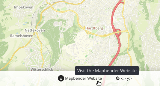
The link element provides a button widget that refers a defined link like a website or script.
Configuration
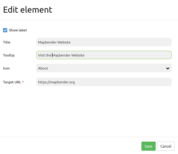
Show label: Enables or disables text (title) next to the button (default: true).
Title: Title of the element. The title will be listed in Layouts and allows to distinguish between different buttons. It will be indicated if “Show label” is activated.
Tooltip: Text, that will be indicated if the mouse hovers over the button for a longer time.
Icon: Symbol of the button. Based on a CSS class.
Target URL Reference to a website or a script.
Hint
It is also possible to deactivate an icon set and/or to use other icons. For more, see Customizing icons.
YAML-Definition
This template can be used to insert the element into a YAML application.
title: Link                                 # title
class: Mapbender\CoreBundle\Element\Button
tooltip: Visit the Mapbender Website        # text to use as tooltip
icon: iconInfoActive                        # icon CSS class to use
label: true                                 # false/true to label the button, default is true
click: https://mapbender.org                # refer to a website or script