HTML
This element allows the integration of HTML anywhere in an application. Figures, links or e.g. texts can be inserted. The following illustration shows the integration of a Mapbender logo in footer, toolbar and sidepane:
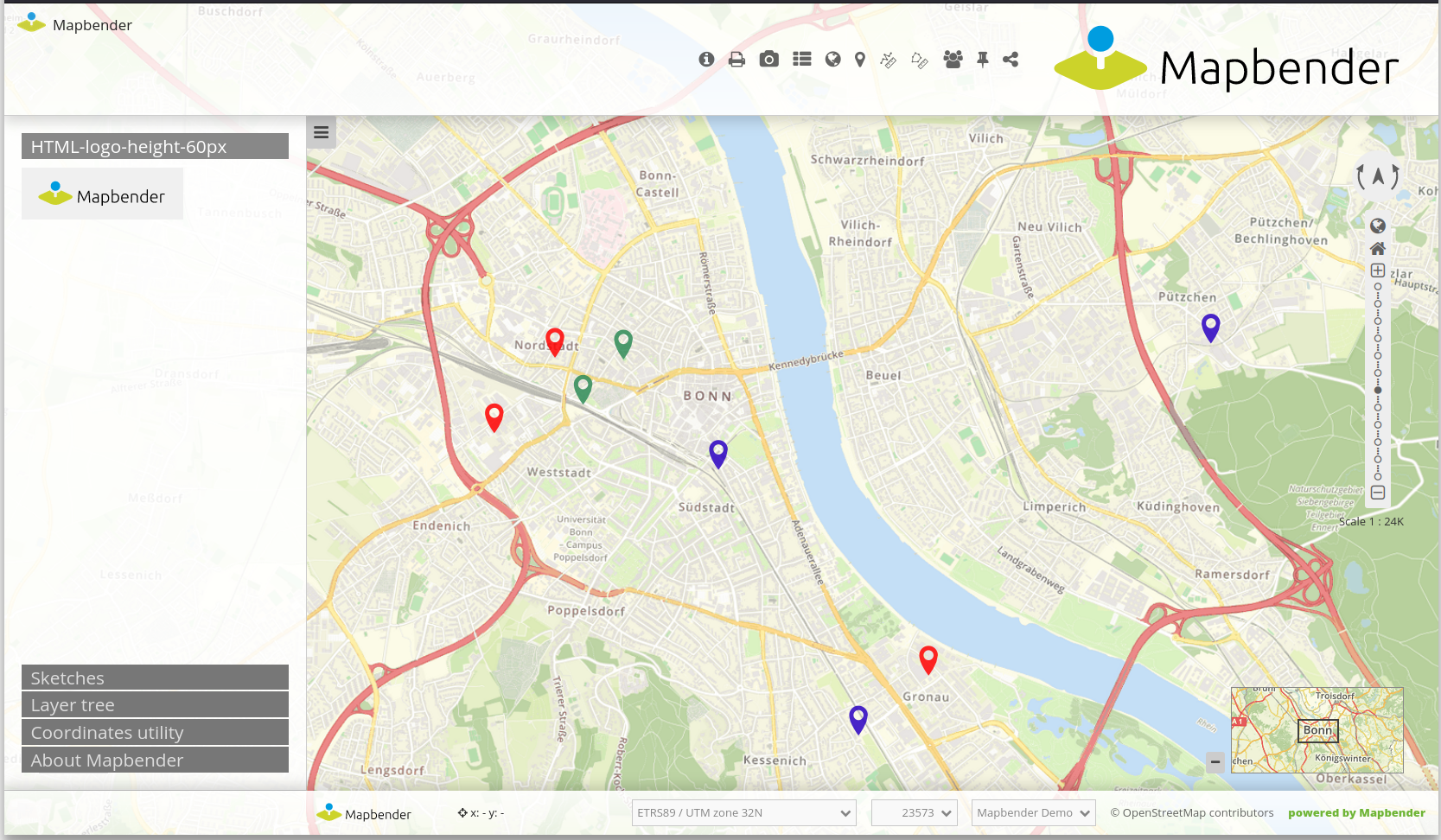
The following variables can be integrated in HTML:
“application” (Entity Application)
“entity” (Entity HTML-Element)
Configuration
This element has to be integrated in the Backend.
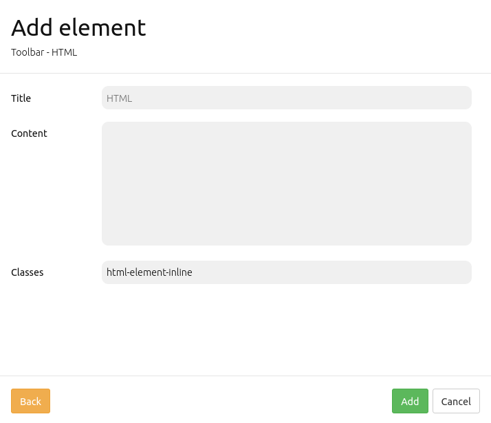
Title: Title of the element. The title will be listed in Layouts.
Content: Content of the HTML-element. The variables “application” and “entity” are available.
Classes: You can refer to a CSS class for the HTML element. The class can be defined in the css editor.
Configuration examples
Insert picture:
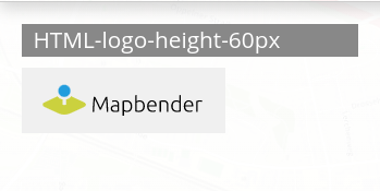
In this example, the Mapbender Logo was integrated in the sidepane. It can be adjusted with a predefined height, background color and transparency as well as a certain padding.
<img src='https://mapbender.org/fileadmin/mapbender/resources/images/logos/Mapbender-Logo.svg'
height='60px' style='background-color:rgb(240, 240, 240, 0.9); padding:10px'>
Insert picture with link:
A linkage was added to the previously inserted logo. It references to the Mapbender website (href='https://mapbender.org') if the logo is clicked on. The link is opened in a new tab because of target='_blank'.
<a href='https://mapbender.org' target='_blank'>
<img src='https://mapbender.org/fileadmin/mapbender/resources/images/logos/Mapbender-Logo.svg'
height='60px' style='background-color:rgb(240, 240, 240, 0.9); padding:10px'></a>
Variables & HTML-Element
Several variables can be integrated in the HTML-Element.
Variable: “application.title”
This variable allows the integration of the application title. In the example, this corresponds to “Konfigurationsbeispiele”.
The HTML-Code could look like this:
<b><span style="font-size:25px;color:#b6dd18;margin-right:50vw"> Anwendung {{ application.title }} </span></b>
The application title is defined through {{ application.title }}. The term “Anwendung” is an addition and will display independently from the actual title. The style-block defines font size, font width, font color as well as position of the title.
The result for the configuration example looks like this:

Variable: app.user.username
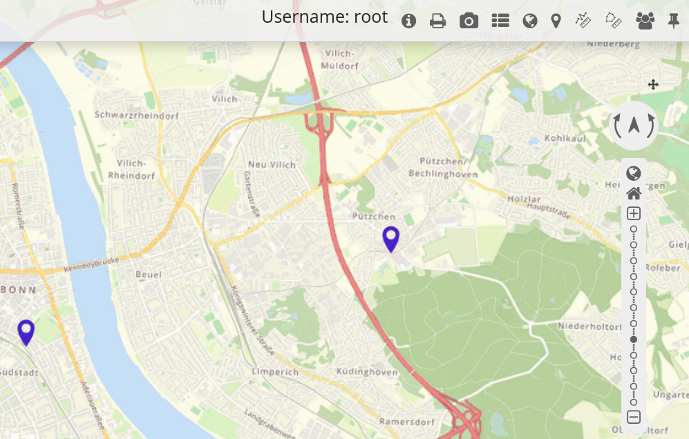
This variable displays the name of the active user:
<p>Username: {{ app.user.username }}</p>
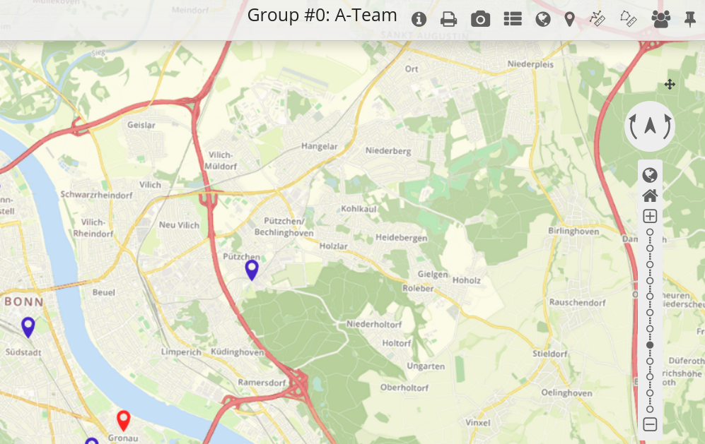
In this example, the user name is displayed in the toolbar:
Variable: group.title
The group of a user cannot be defined in a single expression, because Twig only supports the map-filter in higher versions. In order to integrate this variable, a loop will be used:
{% for index, group in app.user.groups %}
    <p>Group #{{ index }}: {{ group.title }}</p>
{% endfor %}
In this example, index and group name are displayed in the toolbar:
Variable: “entity”
The variable { entity } displays the ID and { entity.title }, which displays the title of the HTML-element.
In the following, the variable { entity.title } was integrated with the text addition “HTML-Element”. The Styling parameters correspond to those of the example with application.title. Text additions, variables and position were simply adjusted for entity.title.
<b><span style=“font-size:25px;color:#b6dd18;margin-right:60vw“> HTML-Element
{{ entity.title }} </span></b>
These variables could look as follows:

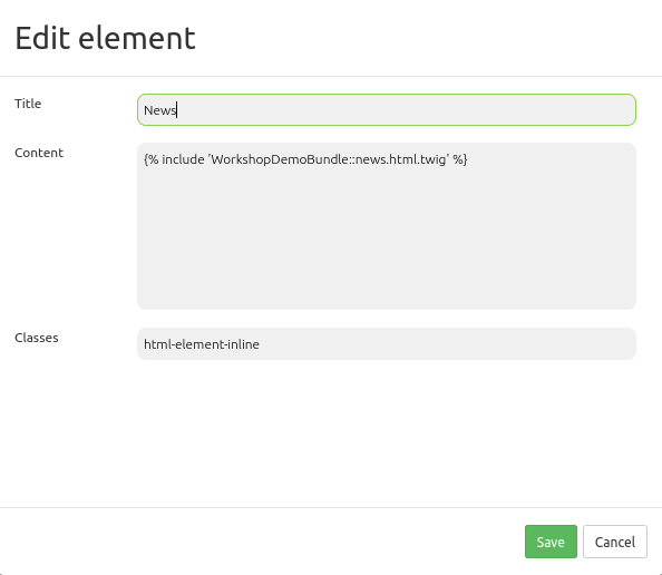
Refer to a twig file
You can refer to a twig file in the Content area. Please note that the twig file has to contain valid HTML.
YAML-Definition
This template can be used to insert the element into a YAML application.
title: 'HTML-Element'
class: Mapbender\CoreBundle\Element\HTMLElement
content: <p>Hello, World!</p><p>Application: {{ application.title |trans }}</p> # The variables "application" and "entity" are available.
classes: my-special-css-class