Layouts
The Layouts section in the Backend of an application gives an overview of the regions (layout sections) of the application. In those regions, the elements of the application are listed. An overview of all elements is available under Elements.
Note
Different templates can have different regions: In the demo applications we use the same region layouts. Not every element can be used in every region. Mapbender cares about that.
Layout of the Fullscreen template:
Top toolbar - region for Buttons, Links, HTML,…
Sidepane - region for Layertree, Legend, Search, Print, HTML,…
Map area - region for Map, Scalebar,…
Footer - region for Copyright, Activity Indicator, Scale select,…
The  button located at the top right of each region allows adding elements. After pressing the button, a dialog will open, which allows for the selection of an element and its subsequent configuration.
All elements in an application can be moved between regions using drag and drop.
The regions themselves can be configured using the  button in the top right corner of each region.
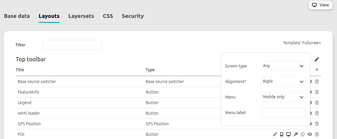
The regions Top toolbar and Footer provide the following configuration options:
Configuration of the Top toolbar and the Footer
The Top toolbar and the Footer provide the following configuration options:
Screen type: (Any, Mobile, Desktop. Default: Any) The region will not be displayed when other screen types are used. Any will always show the region.
Alignment: (Left, Right, Center. Default: Right) Sets the alignment for the buttons, texts, links.
Generate menu for buttons: (No, Desktop only, Mobile only, Desktop + Mobile, Default: Mobile only) Creates a dropdown menu for the elements.
Menu label input field: Labeling for the dropdown menu. Default no Labeling.
Tip
Note: Using the dropdown menu is especially handy on mobile devices. There is a code snippet in CSS editor that adds a scroll bar to the menu and helps to increase the user experience.
YAML Configuration
This template can be used to configure the properties of the toolbar in a YAML application:
- name: toolbar
  properties:
    item_alignment: right  # right/left/center - default right
    screenType: all         # desktop/mobile/all - default all
    generate_button_menu: only_mobile # no/yes/only_desktop/only_mobile - default only_mobile
    menu_label: "Menu" # NULL or text
Besides, this template can be used to configure the properties of the footer in a YAML application:
- name: footer
  properties:
    item_alignment: right # right/left/center - default right
    screenType: all # all/desktop/mobile - default all
    generate_button_menu: only_mobile # no/yes/only_desktop/only_mobile - default only_mobile
    menu_label: "Menu" # NULL or text
Configuration of the Sidepane
The Sidepane provide the following configuration options through their button:
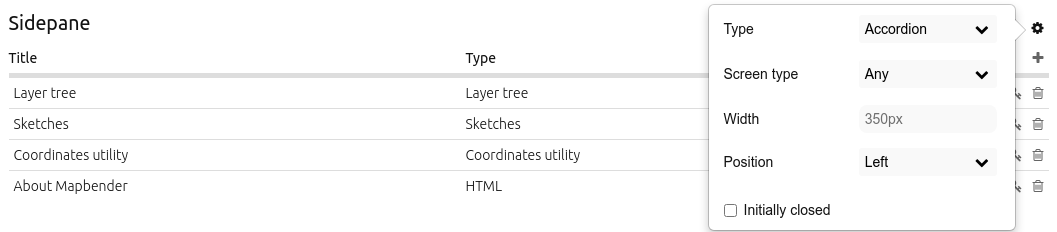
Type (Buttons, Accordion, List, Unstyled. Default: Accordion): See explanation below.
Screen type (Any, Mobile, Desktop. Default Any): The region will not be displayed when other screen types are used. Any - will always show the region.
Width (in px) (in px. Default: 350px): Width of the Sidepane in Pixels.
Resizable (Default: true): Allows to resize the width of the sidepane.
Position (Left, Right. Default: Left): Defines the placement of the sidepane.
Initially closed (No, Desktop only, Mobile only, Desktop + Mobile): Defines whether the Sidepane should be closed or open on start of the application.
The option Type adjusts the inserted elements:
Buttonsshows elements via buttons.Accordionshows elements via tabs.Listshows elements as a list. The active element takes up the entire area of the Sidepane.Unstyleddoes not contain any styling options at all and displays the elements in the configured Backend order.
The option Resizable uses a minimum size of 120 px and a maximum of 95 % of the screen’s width. These values can be further restricted by using custom css:
.sidePane.resizable {
  min-width: 200px;
  max-width: 500px;
}
YAML Configuration
This template can be used to configure the properties of the sidepane in a YAML application:
- name: sidepane
  properties:
    name: accordion # tabs (for button) / accordion / NULL (for unstyled)
    align: right # right/left
    closed: no # no/yes/only_desktop/only_mobile
    screenType: all # all/desktop/mobile
    width: "654px"
Button area (Elements)
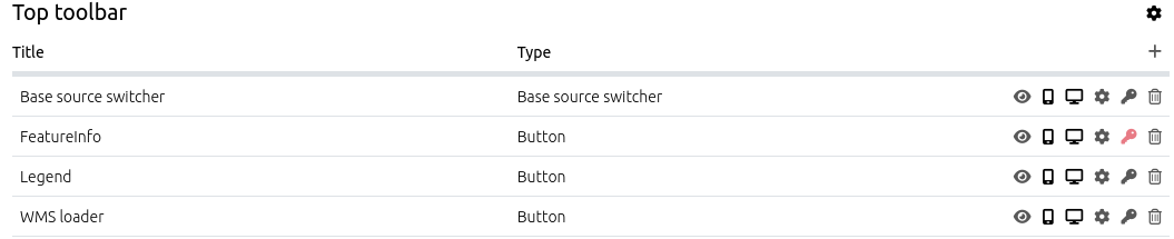
Every element offers a set of buttons for configuration. The button area helps configuring elements in their specific regions.
The following button functions are available:
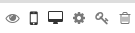
Edit: Adjusts an element.
Show on mobile screens: Displays an element only on mobile-sized screens.
Show on Desktop screens: Displays an element only on Desktop-sized screens.
Restrict element access: Sets specific visibility permissions for an element.
Duplicate element: Creates a copy of the element with the same settings.
Toggle show/hide element: A shown element is visible in the application. A hidden one is not visible in the application itself, but can still be adjusted in the Backend.
Delete: Removes an element from both front- and Backend.
Edit
The button opens a configuration mask for a specific element. The Elements overview page can help you to look up a setting for a specific element.
Restrict element access
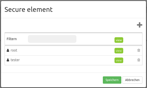
The  button opens a Secure element window that allows the configuration of the View right for users/groups.
Without configuration, an element has no access restriction and is avaible to the users/groups that can access the application.
When View access rights are set, only the defined users/groups get access to the element.
Add users to restrict access to them with the button. A set checkmark next to the user account provides the necessary rights.
After setting specific access rights, the security key turns red.
You can find more security details under Permission management.