Legend
The legend object shows a legend of the layers that are displayed in the map. Not every layer provides a legend. In addition to the legend image you can display the service title, layer name and group name (if a group exists).
Configuration
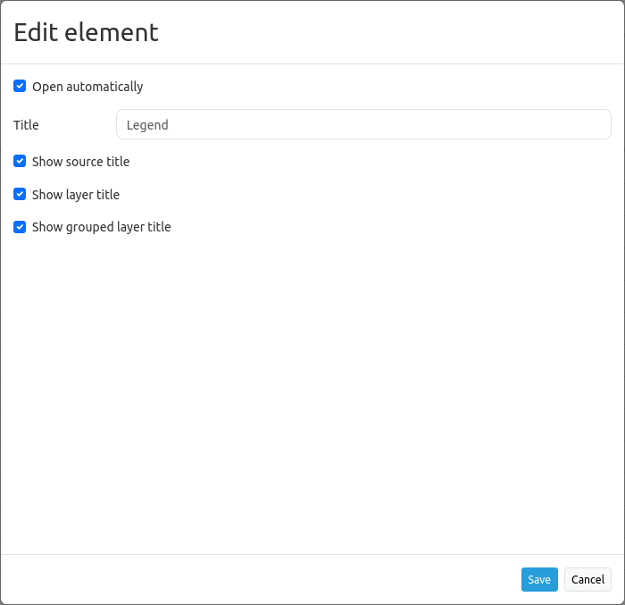
Open automatically: If activated, the legend opens when the application is started (default: active).
Title: Title of the element. The title will be listed under Layouts. Is also shown next to the button, if “Show layer title” is activated.
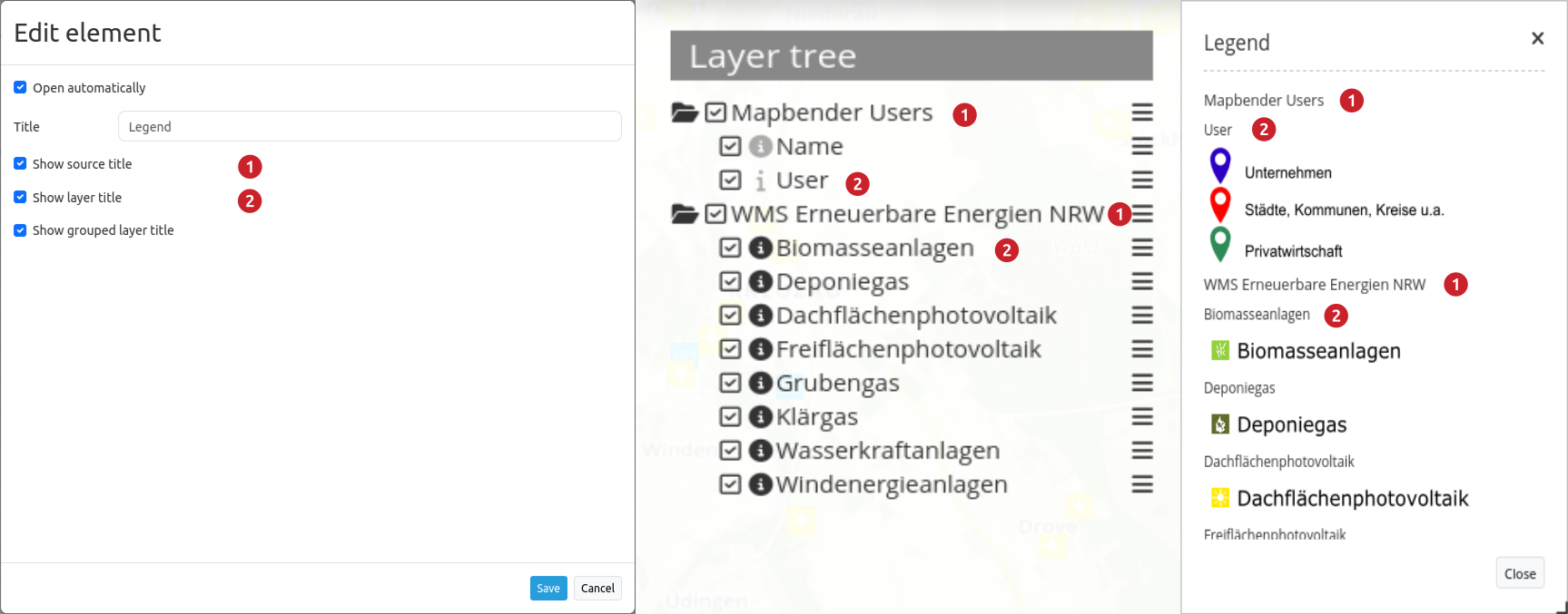
Show source title: shows WMS/source title (default: true)
Show layer title: shows layer title (default: true)
Show grouped layer title: shows group title for grouped layers (default: true)
The Legend element is integrated via a Button or in the sidepane.
Hint
Please note that you can deactivate the legend for a single layer in the instance configuration.

Configuration Examples
Legend in the Sidepane
If you want to integrate a legend in the sidepane, click on  in the Layouts-tab (section “Sidepane”).

Then, choose the element “Legend” in the appearing window. The configurational dialog “Add element – Legend” will open.
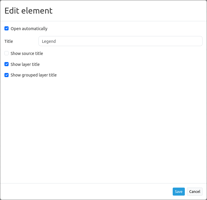
Our configured element has the title “Legend”. The legend opens automatically (set checkbox Open automatically). Moreover, the layer title and the title of all grouped layers will appear if the checkboxes Show layer title and Show grouped layer title are set.
Given this configuration, the result looks like this:
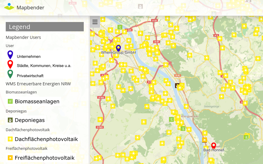
In the example the legend was added to the sidepane.
Legend in the toolbar
The legend element can be integrated with a button in the toolbar. First step: Open the application Backend and add the legend element into the map area section of the Layouts tab.

In this example, the following settings are chosen:

As soon as this element has been implemented into the map area, a Button has to be implemented into the toolbar section. Following these instructions, the result in the application looks like this:

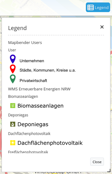
The toolbar shows the button for the legend element. If the button is clicked, the dialog with the generated legend opens. With the “Open automatically” setting, the dialog is displayed directly when the application is started.
The activation and deactivation of checkboxes in the configurational settings leads to:
YAML-Definition
This template can be used to insert the element into a YAML application.
tooltip: 'Legend'                    # text to use as tooltip
elementType: dialog                  # dialog/blockelement (default: dialog)
autoOpen: true                       # true/false open when application is started (default: true)
displayType: list                    # accordion/list type of display (default: list)
target: ~                            # Id of Map element to query
hideEmptyLayer: true                 # true/false hide when no legend is available (default: true)
showWmsTitle: true                   # true/false show WMS title (default: true)
showLayerTitle: true                 # true/false show layer title (default: true)
showGroupedLayerTitle: true          # true/false show group title for grouped layers (default: true)
You can optionally use a button to show this element. See Button for inherited configuration options.